What My Apple Watch Data Revealed About Cardiovascular Fitness
February 26, 2026
Summary
With the assistance of Claude Code, I analyzed more than 640 hours of running, cycling, and elliptical workouts collected over five years. The clearest gains in fitness came early: my resting heart rate fell by about eight beats per minute in the first year and stayed lower afterward. Running pace improved quickly before leveling off, even as training continued. Despite a long break from running due to plantar fasciitis, cross-training preserved most of my aerobic capacity. Different activities produced distinct intensity patterns, with the elliptical often matching or exceeding the effort of cycling. Although Claude Code exhibited some flaws, it ultimately proved to be a very useful partner in making sense of the data.
Introduction
In late March 2020, as the Covid-19 pandemic was forcing most of us indoors, I made a decision that would turn out to be one of the better choices of my adult life: I bought a stationary exercise bike. Prior to that point, my lifestyle had been largely sedentary, punctuated by only sporadic and short-lived attempts at regular exercise. I am currently 60 years old, and my health history includes mildly elevated blood pressure (managed with losartan), Hashimoto’s thyroiditis (managed with levothyroxine and liothyronine), and pre-diabetes (managed with metformin). None of these conditions is severe, but together they provided additional motivation to take exercise seriously.
A word about this document before we go any further. Someone once observed that health metrics are like diseases: your own are fascinating; other people’s, not so much. Fair warning. I created this report for three reasons: it was genuinely fun to look at my own data; it provides a practical basis for planning future improvements to my exercise routine; and, most importantly, it served as a hands-on project for teaching myself how to use Claude Code, Anthropic’s AI-powered coding assistant. Readers who find the level of detail here excessive are probably right.
On November 21, 2020, I purchased an Apple Watch and began systematically recording my workouts and heart rate data. Note that the data presented here does not capture the first eight months of my exercise program, covering the period when the most dramatic physiological adaptations were likely occurring. All data was exported from Apple Health and processed using the R statistical computing environment with the assistance of Claude Code. The period covered runs from November 2020 through early 2026, over five years. Three workout types are analyzed: indoor cycling, outdoor running, and elliptical training. (A fourth activity, short neighborhood walks taken with my wife, is recorded in the Apple Health data but excluded, as it is not part of my fitness regimen in any meaningful sense.)
Brief Program Overview
My exercise program over this period consisted of three workout types: indoor cycling, outdoor running, and elliptical training. Running was interrupted by a 14-month recovery from plantar fasciitis, beginning in April 2024. Full details on each activity are in the Exercise Program section below.
Results
Exercise vs. Resting Heart Rate
This graph appears first in the Results section for a simple reason. It answers the question any reasonable reader is likely to ask first: Did five years of regular exercise actually work? The answer, visible at the left edge of the graph, is clear and dramatic.
Resting heart rate is one of the most reliable indicators of cardiovascular fitness. As the heart becomes stronger and more efficient through aerobic training, it can pump more blood per beat and therefore needs to beat less frequently at rest. The graph below shows two trends simultaneously: my average heart rate during each exercise session across all three workout types (blue, left axis), and my nightly resting heart rate computed from Apple Watch readings between 1 and 5 a.m. (red, right axis). The smoothed trend lines used here and throughout the report are LOESS curves (Locally Estimated Scatterplot Smoothing), a flexible method that fits local regressions to follow the actual shape of the data rather than imposing a single straight line. The shaded band around each curve is a 95% confidence interval; a narrower band indicates greater certainty, while a wider band reflects more uncertainty, typically where data is sparse.

Figure 1: Exercise heart rate per session across all workout types (blue, left axis) and nightly resting heart rate (red, right axis) over time. Workout types consist of cycling, running, and elliptical training. Resting heart rate is computed as the average of Apple Watch readings recorded between 1 and 5 am. Individual daily resting HR readings are not shown; only the smoothed trend is displayed.
The most striking feature of this graph is the sharp decline in resting heart rate visible at the left edge, from approximately 71 beats per minute (bpm) in late 2020 down to roughly 63 bpm by late 2021. This drop of approximately 8 bpm over a year is a textbook cardiovascular adaptation to the onset of a regular aerobic exercise program. It is worth noting that this decline was already underway before the Apple Watch data begins, given that I had been exercising for eight months prior to November 2020. The initial resting heart rate of 71 bpm therefore likely already reflects some improvement from wherever my true baseline was.
After reaching approximately 63 bpm, resting heart rate stabilized and has remained in that range ever since, including during a prolonged period when I was not running. This is a meaningful finding: it suggests that cycling and elliptical training were sufficient to maintain the cardiovascular gains that running had helped produce.
The smoothed curves in the middle portion of the graph show a number of peaks and valleys that are harder to interpret. It is tempting to search for explanations such as seasonal variation, changes in training load, illness, or stress, but the honest answer is that I do not know what drives these fluctuations. Unlike the sharp drop at the left edge or the uptick at the right edge, the patterns in the middle do not tell a clear story.
At the right edge of the graph, resting heart rate appears to be declining slightly further, consistent with the resumption of running after a lengthy recovery from plantar fasciitis (more about this below). Whether this represents a new phase of cardiovascular adaptation or simply normal variation remains to be seen as more data accumulates. The sections that follow examine the running-specific metrics individually: pace, distance per session, and per-session heart rate.
Exercise Intensity Over Time
The graph below shows exercise intensity, defined as kilocalories burned per hour per kilogram of body weight, across all three workout types over the full five-year period. This metric reflects how hard I was working during each session, independent of session duration. The intensity values are computed by Apple’s algorithms, which are not fully documented; the metric is understood to be derived primarily from heart rate and personal characteristics rather than direct measurement of mechanical output. It is best treated as a relative, within-person indicator rather than an absolute measure.
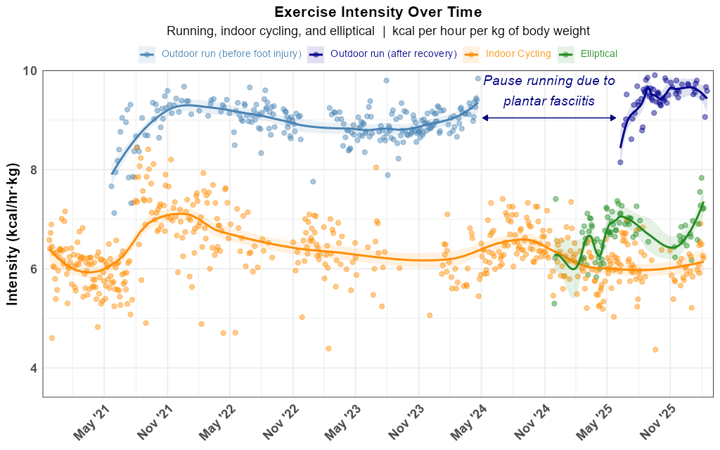
Figure 2: Exercise intensity over time for outdoor running, indoor cycling, and elliptical training. Smoothed trend lines (LOESS) are shown for each workout type. The two running curves correspond to the pre-injury and post-recovery periods, respectively.
Outdoor running consistently registers the highest intensity of the three exercise types, which aligns with running’s well-established reputation as an efficient cardiovascular workout. The more striking and non-obvious finding, however, is that elliptical training consistently registers higher intensity than indoor cycling, despite the fact that cycling sessions involve 45-second all-out sprints every four minutes. Put differently: the elliptical provides a more intense workout than sprint cycling, while simultaneously being somewhat less unpleasant. This finding has substantially influenced my thinking about how to structure my non-running workout time going forward.
The gap in the running data between April 2024 and June 2025 reflects a plantar fasciitis injury that kept me from running for approximately 14 months; the full story is described in the section below. Because the injury created a meaningful break in the running record, the running data is fitted with two separate LOESS curves, one for the pre-injury period and one for post-recovery, allowing the trend in each period to be evaluated independently.
Running Pace Over Time
For those who run regularly, pace, typically expressed in minutes per mile, is perhaps the most intuitive measure of performance. The graph below shows my per-session running pace across all outdoor runs from May 2021 onward. Note that on this graph, faster paces appear lower on the vertical axis.
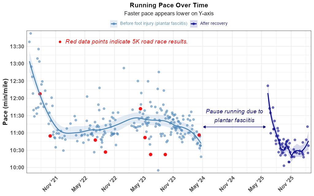
Figure 3: Running pace per outdoor session over time. Faster paces appear lower on the vertical axis. Pre-injury and post-recovery periods are shown in separate colors with independent LOESS curves. Red data points indicate 5K road race results; the faster pace times seen in most races reflect the higher effort level I brought to competitive running, relative to my typical training runs.
Pre-injury, my pace shows a modest downward trend, indicating I was gradually running faster. This faster pace may have contributed to the injury, as steadily increasing exertion is a recognized risk factor for overuse injuries such as plantar fasciitis. The most likely explanation for the improving pace is genuine improvement in cardiovascular fitness. My running distances were not decreasing during this period, and there is no reason to think my effort level was changing systematically. Post-recovery data is still accumulating, but early indications suggest I have returned to roughly the same pace range as before the injury.
Running Distance Per Session Over Time
Running distance provides a complementary view of my training load over time. The graph below shows the distance in miles for each outdoor run session, with the same pre-injury and post-recovery split visible in the other running graphs.

Figure 4: Running distance per outdoor session over time, in miles. Pre-injury and post-recovery periods are shown in separate colors with independent LOESS curves.
The data reflects a fairly consistent range of session distances throughout the pre-injury period, without a strong directional trend. This context is relevant to interpreting the pace graph above: the gradual improvement in running speed seen there is not simply an artifact of running progressively shorter distances over time.
Running Heart Rate Over Time
Pace alone is an incomplete measure of running performance, because it does not account for effort. A given pace might be achieved at very different levels of cardiovascular exertion depending on fitness, conditions, and fatigue. Average heart rate per session provides a complementary perspective.

Figure 5: Average heart rate per outdoor running session over time. Pre-injury and post-recovery periods are shown in separate colors with independent LOESS curves. Red data points indicate results from a recurring 5K road race series.
The pre-injury period shows running heart rate peaking in late 2021 and then gradually declining through 2023, a pattern consistent with improving cardiovascular efficiency, though it could also partly reflect running at an easier effort level over time. After returning from injury, heart rate starts relatively low and rises as training intensity increases, which is the expected pattern following a period of deconditioning specific to running. The red data points represent results from nine 5K races, all run on the same course. In seven of the nine races, heart rate was substantially elevated compared to typical training runs, reflecting the higher level of effort I brought to competitive racing.
My Exercise Program
My workouts have consisted primarily of three types of exercise: indoor cycling, outdoor running, and elliptical training.
My approach to exercise frequency has evolved over time. When I first began, I aimed to exercise every day. I soon found this impractical given the demands of daily life, and settled on an every-other-day schedule, which also has the physiological benefit of allowing the body adequate time to recover between sessions. In more recent years, I have settled on a target of three sessions per week, typically on Mondays, Wednesdays, and Fridays, though this schedule must remain flexible to accommodate the inevitable scheduling conflicts that arise. In practice, the data shows that I have averaged 2.89 exercise sessions per week (essentially three days per week) over the full period covered by this report. On days when I completed both a cycling and an elliptical session, those are counted as a single exercise day.
Indoor cycling is where my exercise program began, and it has remained a central part of my routine ever since. It serves primarily as my fallback activity on days when the weather makes outdoor running impractical, which in Upstate New York means a substantial portion of the year. I ride a stationary bike and structure my sessions around 45-second sprints performed every four minutes, which provides a high-intensity interval component on top of the steady-state cycling. I will be candid: of the three exercise types in my program, cycling is the one I find most unpleasant. Both cycling and elliptical training are made more tolerable by the fact that I can watch movies and television shows while exercising (something that is obviously not possible when running outdoors). Even so, the cycling workouts present a particular challenge: the sprints. Pushing myself to near-maximum effort every four minutes is simply physically unpleasant in a way that steady-state aerobic exercise is not. In a subjective sense, I typically feel more fatigued after a cycling session than after a comparable run or elliptical workout, even when the objective intensity metrics suggest otherwise. Cycling also proved invaluable during my recovery from a running injury (described below), when I was unable to run at all.
Outdoor running became a regular part of my routine beginning in May 2021. Though I would not describe running as enjoyable, I find it considerably more tolerable than cycling, and it quickly became my preferred form of exercise. I run in my neighborhood on side streets that have relatively little traffic. On the rare occasions when I run after dark, I wear safety gear including flashing LED lights and a reflective vest. I have run nine 5K road races since beginning my running program; those races are indicated by red data points in several of the graphs above.
Elliptical training was added to my program after I began experiencing hip pain attributable to my cycling workouts. The elliptical provided a lower-impact alternative that did not aggravate the hip. Fortunately, the hip pain resolved on its own without any formal treatment and has not recurred, but the elliptical has remained a useful part of my routine. Looking ahead, I plan to gradually shift the balance of my non-running workouts toward the elliptical and away from cycling, a decision supported by the intensity data shown above.
Plantar Fasciitis: A Significant Interruption
In April 2024, I began experiencing significant heel pain, subsequently diagnosed as plantar fasciitis, an inflammation of the thick band of tissue connecting the heel bone to the toes. The condition is notoriously difficult to treat. My podiatrist prescribed stretches, orthotics, NSAIDs, and an oral steroid, but none of these seemed to help much. My recovery was most likely simply a matter of time. I was unable to run for approximately 14 months, resuming in June 2025. Throughout this period, I continued cycling and using the elliptical to maintain my cardiovascular fitness.
Conclusions
Several conclusions emerge from this data, some practical and some simply interesting in their own right.
From a practical standpoint, the data provides some evidence that running produces a more intense cardiovascular stimulus than either cycling or elliptical training, as measured by heart rate during exercise. At the same time, the resting heart rate data suggests that lower-impact alternatives can be effective at maintaining cardiovascular fitness when running is not possible, whether due to weather, injury, or other factors. This kind of nuanced understanding of which exercise types provide the most benefit could be genuinely useful in designing a sustainable long-term fitness regimen. A finding I did not anticipate, and one that has directly influenced my plans going forward, is that elliptical training consistently outperformed sprint cycling in terms of exercise intensity, which makes the gradual shift toward more elliptical work an easy decision.
Beyond the practical implications, there is something inherently compelling about examining one’s own physiological data over time. The patterns visible in these graphs tell a story that would be invisible without systematic self-tracking: the initial dramatic drop in resting heart rate, the gradual improvement in running efficiency, the resilience of cardiovascular fitness through a prolonged injury. Even when the actionable implications are limited, the data offers a richer and more honest account of one’s fitness trajectory than subjective perception alone ever could. For those inclined toward self-experimentation, the Apple Watch and similar devices make this kind of longitudinal self-analysis accessible in a way that was simply not possible a decade ago.
I was genuinely surprised by how quickly I made progress after starting my exercise program, particularly the sharp drop in resting heart rate during the first year. That said, I have been disappointed by how quickly I reached a plateau, both in terms of running pace and resting heart rate. The data shows relatively little change in either metric over the past two to three years, which is motivating in the sense that there is clearly room for improvement, but also a little discouraging. One of my goals going forward is to research what kinds of training changes (in terms of intensity, frequency, or structure) might help me move past this plateau. I also plan to incorporate some form of strength training in the future, as the evidence for its benefits for both cardiovascular health and long-term physical function is well established.
I should be honest about something the numbers cannot capture: I am, by temperament and perhaps by genetics, a fundamentally sedentary person. I was not particularly athletic when I was young, and even after five years of regular exercise, I still genuinely dislike it. Every workout requires a deliberate act of will. That I have managed to maintain this routine for as long as I have is, I think, a testament to genuine discipline, and I say that as someone who does not typically think of himself as especially disciplined. This is one area where I seem to have surprised myself. There is one partial exception worth mentioning: on an ideal spring day, warm but not hot, with a mild breeze and some sunshine, running through my neighborhood comes almost (but not quite) into the range of something resembling pleasure. Cycling and elliptical training, I can say without qualification, are never the least bit of fun.
Thoughts on Using an AI Tool
Claude Code proved to be an impressive tool throughout this project. It handled data cleaning, visualization design, and text drafting with speed and competence. I encountered no instances of hallucination. Minor coding mistakes did occur occasionally, but they were easily identified and corrected. Large-scale reorganizations of the write-up sometimes led to continuity errors. On one occasion, Claude Code didn’t notice any problem when it produced a graph showing physiologically implausible heart rates.
The more interesting limitations were subtler. On several occasions, Claude Code made recommendations I ultimately disagreed with. They were not unreasonable suggestions, but they did not align with my judgment about what the report should say or how it should be structured. Conversely, when I asked it to add sections that were, in retrospect, excessively wordy and added relatively little to the core narrative, it complied without objection. A more assertive and opinionated collaborator would have pushed back. One limitation may be inherent to using AI tools for writing: the prose Claude Code produced was professional, but it didn’t sound like something I would have written myself.
Still, the overall verdict is clear: Claude Code is quite capable and is a valuable tool for projects of this kind. It requires oversight, and users who trust the output uncritically do so at their own risk, but it makes data analyses of this scope far more tractable than they would be if performed manually.
Data collected via Apple Watch beginning November 21, 2020. Analysis performed in R with assistance from Claude Code (Anthropic). All graphs generated using ggplot2.